Can you differentiate your product or brand on the shelf?
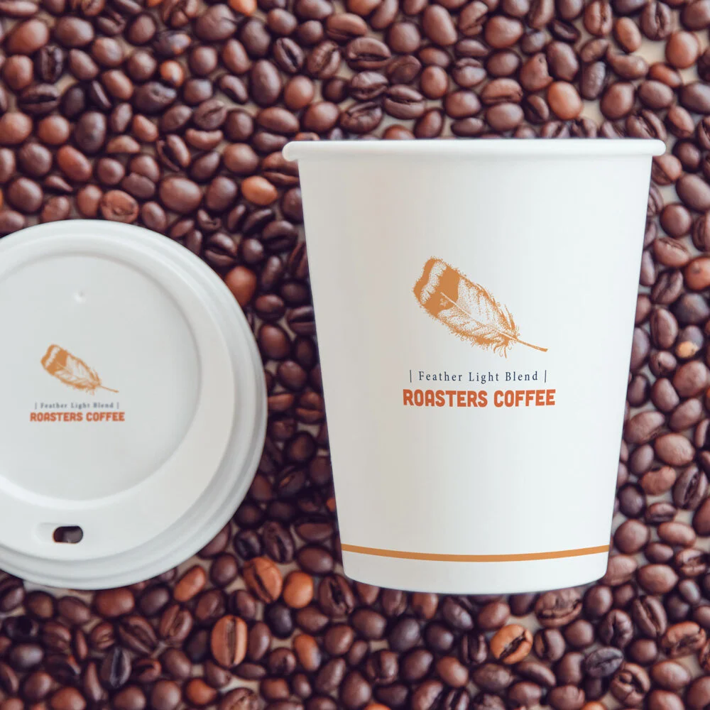
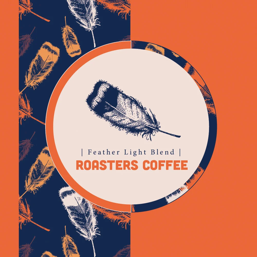
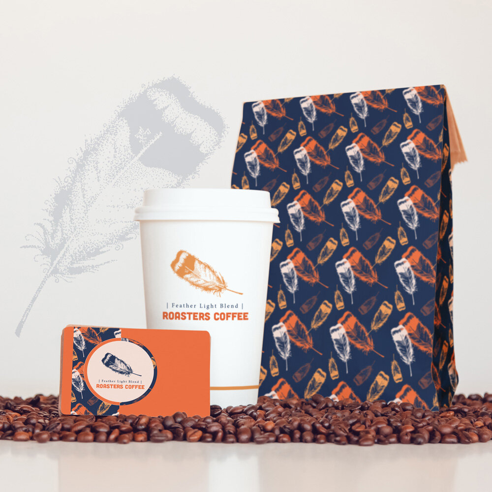
Well, that’s what the competition is using. Why would you want to fit in and be another boring brand on the shelf. Stand out! This cohesive branding uses a feather! Yes, something different and not expected for a coffee shop.
Visual imagery and color is important in packaging. A unique attractive approach is key to getting the customers attention and ultimately affecting the buying decision.
How can I help you make an impact on the shelf?
My hand drawn custom illustrations elevate the look of packaging and help your brand stand out from the noise.
Don’t get lost on the shelf! You have a great product and your packaging should entice customers to purchase, be unique and memorable so the next time they are shopping they chose you!
This feather illustration is hand drawn in all ink dots! Hoot Design Studio provides custom artwork and design to enhance your product and tell your one-of-a-kind story.


